
Theme settings
Theme settings are global settings. They apply to every page of your store. This page explains each group in Theme settings, in the order you see them in the theme editor.
To open Theme settings:
- Go to Online Store → Themes.
- On the Tenora theme card, select Customize.
- In the theme editor, select Theme settings (the gear icon).
The recommended values below are the defaults of the Tenora preset, unless the text says otherwise.
Logo and favicon
| Setting | What it does | Recommended value |
|---|---|---|
| Logo | The logo image in the header and on the password page. Without a logo, the header shows your store name as text. | A transparent .png or .svg |
| Logo width | The width of the logo, from 40 to 300px. | 120px |
| Favicon image | The small icon in the browser tab. | A 32 x 32px .png |
Tips
- The logo is never taller than 56px in the header. A tall logo stays compact, so a wide logo usually looks best.
- The logo uses the alt text of the image. If the image has no alt text, the store name is used. Add alt text to the logo in Content → Files.
- Store names without a logo that are longer than 18 characters are shown in a smaller text size. For a long store name, we recommend uploading a logo.
- For a light version of your logo over the image banner, use the Transparent header logo setting in the Header section.
Colors
Color schemes
A color scheme is a set of colors that you apply to a section. Tenora has 5 color schemes. Most sections have a Color scheme setting, so you can choose a different scheme for each section.
Each color scheme has these colors:
| Color | Where it's used |
|---|---|
| Background | The background of the section |
| Text | Headings, body text and icons |
| Accent | Links, active states and the dimension line details |
| Button background | The background of solid buttons |
| Button label | The text on solid buttons |
| Outline button label | The text and border of outline buttons |
To edit a color scheme:
- Go to Theme settings → Colors.
- Select the color scheme you want to change.
- Change the colors. The preview updates right away.
- Select Save.
Recommendations
- Keep a contrast ratio of at least 4.5:1 between Text and Background, and between Button label and Button background. All color pairs in the three presets meet this level (WCAG AA).
- Keep one light scheme for most pages and one dark scheme for the footer, as in the presets.
- Error and success messages use the scheme's text color with a colored icon, so they stay readable on every scheme.
Surfaces
| Setting | What it does | Recommended value |
|---|---|---|
| Show grain texture | Adds a subtle paper-like texture to backgrounds. | On for light, natural styles (Tenora, Terrace). Off for dark styles (Lantern). |
Typography
Headings
| Setting | What it does | Recommended value |
|---|---|---|
| Font | The font for headings. Choose from the Shopify font library. | Cormorant (Tenora), Fraunces (Terrace), Bodoni Moda (Lantern) |
| Heading size scale | Controls how much larger each heading level is than body text. Options: Compact, Balanced, Expressive. | Balanced |
| Capitalization | Default keeps your text as you typed it. Uppercase shows headings in capital letters. | Default |
Body text
| Setting | What it does | Recommended value |
|---|---|---|
| Font | The font for body text, buttons and labels. | Instrument Sans (Tenora), Work Sans (Terrace), Manrope (Lantern) |
| Font size | The base text size, from 14 to 20px. | 16px |
Tip: Choose fonts that include the characters of all your store languages. Some fonts don't support every alphabet. If a character is missing, the browser shows a fallback font for it.
Layout
| Setting | What it does | Recommended value |
|---|---|---|
| Page width | The maximum width of the content. Options: Narrow (1200px), Standard (1440px), Wide (1680px). | Standard |
| Page margin | The space at the left and right of the page, from 16 to 80px. It scales down automatically on small screens. | 48px |
| Section spacing | Scales the top and bottom padding of every section. Options: Compact, Standard, Spacious. | Standard |
| Grid spacing | The space between items in grids, such as product cards, from 8 to 48px. | 24px |
Buttons
| Setting | What it does | Recommended value |
|---|---|---|
| Corner radius | Rounds the corners of buttons, from 0 to 40px. 0 gives square corners. | 0px (Tenora, Lantern), 24px (Terrace) |
| Border thickness | The border width of outline buttons, from 1 to 3px. | 1px |
| Capitalization | Default or Uppercase button labels. | Uppercase (Tenora, Lantern), Default (Terrace) |
Branded payment buttons, such as Shop Pay, keep their own colors and style. The theme doesn't change them.
Inputs
These settings apply to form fields, such as the quantity selector, the email signup field, the "Will it fit?" fields and contact form fields.
| Setting | What it does | Recommended value |
|---|---|---|
| Corner radius | Rounds the corners of fields, from 0 to 24px. | Match your button style: 0px with square buttons, about 8px with rounded buttons |
| Border thickness | The border width of fields, from 1 to 3px. | 1px |
Product and collection cards
| Setting | What it does | Recommended value |
|---|---|---|
| Style | The look of product cards. Standard shows the image and text only. Framed places the card on a light surface with padding. Swatch adds a material-sample tab to the card image. | Swatch (Tenora), Standard (Terrace), Framed (Lantern) |
| Image ratio | The shape of card images. Options: Adapt to image, Portrait, Square, Landscape. | Portrait for furniture photos, Square for lighting and small items |
| Corner radius | Rounds the corners of cards, from 0 to 24px. | 0px, or 8px with rounded buttons |
Tip: With Adapt to image, each card uses the shape of its own product image. Use it only if all your product images have the same shape. Otherwise the grid looks uneven.
Currency format
| Setting | What it does | Recommended value |
|---|---|---|
| Show currency codes | Shows prices with the currency code, for example "$12.00 USD" instead of "$12.00", on product pages, product cards, the cart and the cart drawer. | On if you sell in several currencies that share a symbol, such as USD, CAD and AUD. Otherwise off. |
The estimated total in the cart always shows the currency code. For more information, see Selling globally.
Cart
| Setting | What it does | Recommended value |
|---|---|---|
| Cart type | Drawer opens the cart as a side panel when a customer adds a product or selects the cart icon. Page takes the customer to the cart page. | Drawer |
| Show order note | Shows an "Add an order note" field in the cart drawer and on the cart page. Customers can use it for delivery instructions. | On |
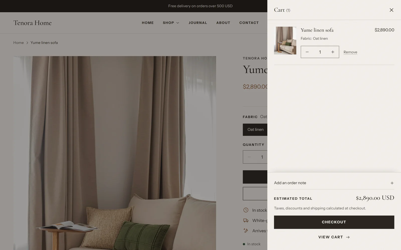
The cart drawer has its own settings. To edit them, open the theme editor, select the Cart drawer section, and change Color scheme or Show dynamic checkout buttons.
Search
| Setting | What it does | Recommended value |
|---|---|---|
| Enable predictive search | Shows products, suggestions, collections, pages and articles while the customer types in the search panel. When it's off, the search panel still works and opens the search results page. | On |
| Show product price | Shows the price next to products in predictive search. This setting is visible only when predictive search is on. | On |
Social media
Enter the full address of each social media account, for example https://www.instagram.com/yourstore. Leave a field empty to hide that icon.
The available accounts are: Facebook, Instagram, Pinterest, TikTok, X (Twitter), YouTube, Vimeo, Tumblr and Snapchat.
The icons appear in:
- the Social media icons block of the Footer section
- the menu drawer on phones and tablets
If no account is filled in, no icons are shown.